In the world of retail, colors are more than just a visual treat; they play a crucial role in store design and branding. But have you ever wondered what role color actually plays? Well, get ready to dive into the fascinating world of how color influences our shopping experience!
Imagine walking into a store where everything is painted in shades of grey or a candy shop where vibrant colors burst from every corner. How would each of these experiences make you feel? Color has the power to evoke emotions, create a mood, and even influence our purchasing decisions. So, let’s explore the captivating role that color plays in store design and branding.
From the soothing blue hues of a spa to the energetic reds of a fast-food restaurant, colors can speak to our subconscious and shape our perception of a brand. Join me on this colorful journey as we uncover the psychology behind different colors and discover how savvy retailers use them to create unforgettable shopping experiences.
So, are you ready to discover the fascinating world of colors in store design and branding? Let’s embark on this exciting adventure together and explore how colors can shape our perceptions, influence our emotions, and even impact our decision-making process. Get ready to see the vibrant world of retail in a whole new light!
The Role of Color in Store Design and Branding
Welcome to this in-depth exploration of the role that color plays in store design and branding. Color is a powerful tool that influences customer perception, emotions, and purchasing decisions. In this article, we will delve into the psychology of color, the impact of color on brand identity, and practical tips for incorporating color effectively in store design. Whether you are a retail business owner, a visual merchandiser, or simply curious about the role of color in the retail industry, this article will provide valuable insights and guidance.
The Psychology of Color
Color has a profound impact on human psychology and can evoke different emotions, reactions, and associations. Understanding the psychology of color is essential for designing effective store environments that captivate and engage customers. Here are some key insights into the psychological effects of different colors:
The Importance of Color in Branding
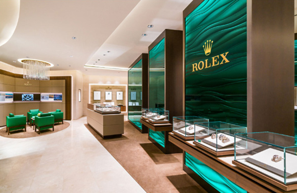
Colors play a crucial role in building brand identity and communicating messages to consumers. When used strategically, color can evoke brand recognition, create emotional connections with consumers, and convey the unique qualities and values of a brand. Here are some ways in which color is leveraged in branding:
Tips for Effective Use of Color in Store Design
Now that we understand the psychological impact of color and its role in branding, let’s explore some practical tips for using color effectively in store design to create memorable and impactful experiences for customers:
The Benefits of a Cohesive Color Palette
Using a cohesive color palette throughout your store design is not only visually appealing but also offers several benefits for your business:
Color Combinations and Visual Hierarchy
When planning your store design, consider the visual hierarchy created by different color combinations. Here are some ways to use color combinations to create an effective visual hierarchy:
Using Color to Guide Customer Flow
The strategic use of color can also help guide customer flow within your store, ensuring that customers navigate through the space in an intuitive and efficient manner:
Creating Emotional Connections Through Color
Color has the power to evoke specific emotions and create memorable experiences. Here are some ways to use color to create emotional connections with customers:
The Role of Color in Store Signage
In addition to store design, color also plays a significant role in store signage. Effective signage is crucial for attracting attention, conveying messages, and guiding customers. Here’s how color can enhance the impact of your store signage:
Key Takeaways
In conclusion, color has a significant impact on store design and branding. By understanding the psychology of color, leveraging it strategically in branding, and incorporating it effectively in store design, businesses can create powerful experiences for customers and reinforce their brand identity. Remember to use a cohesive color palette, consider color combinations and visual hierarchy, guide customer flow, and create emotional connections with color. By doing so, you can create a visually stunning and emotionally compelling store environment that leaves a lasting impression on customers.
Key Takeaways: The Role of Color in Store Design and Branding
- Colors can affect people’s emotions and perceptions in a store.
- Using the right colors can influence customers’ behavior and buying decisions.
- Warm colors like red and orange can create a sense of excitement and urgency.
- Cool colors like blue and green can evoke feelings of calmness and trust.
- Consistency in color choices across branding materials and store design helps strengthen brand identity.
Frequently Asked Questions
Welcome to our FAQ section on the role of color in store design and branding. Here, we will answer some common questions related to how color impacts the overall design of a store and influences a brand’s identity. Read on to discover the significance of color in creating a memorable shopping experience.
Q1: What impact does color have on store design?
Color plays a crucial role in store design as it affects our emotions, perceptions, and behaviors. Different colors evoke different responses from customers. For example, warm colors like red and orange can create a sense of excitement and urgency, while cool colors like blue and green promote relaxation and trust. The careful selection and placement of colors in a store can influence customers’ moods, enhance their shopping experience, and ultimately drive purchase decisions.
Moreover, color can also reinforce a brand’s identity and help differentiate it from competitors. Consistent use of color in store design not only creates a cohesive and memorable visual experience but also reinforces the brand’s values and personality. By strategically incorporating brand colors into various elements of the store, such as signage, packaging, and displays, a retailer can establish a strong brand presence and create a lasting impression on customers.
Q2: How does color impact brand perception?
Color has a significant impact on how consumers perceive and connect with a brand. A well-chosen color palette can evoke certain emotions and associations, shaping consumers’ perceptions of a brand’s personality, quality, and trustworthiness. For example, vibrant and energetic colors like red and yellow are often associated with youthfulness and excitement, making them suitable for brands targeting a younger audience. On the other hand, muted and pastel colors create a sense of sophistication and elegance, appealing to luxury brands.
Furthermore, color consistency across all brand touchpoints, including store design, logo, packaging, and marketing materials, helps in building brand recognition and recall. When customers consistently encounter the same colors associated with a brand, it reinforces their memory and makes the brand more easily identifiable. By leveraging color effectively, brands can shape consumer perceptions, establish a unique brand identity, and increase brand loyalty.
Q3: Can color influence customer behavior in a store?
Yes, color can influence customer behavior in a store. By using color strategically, retailers can create a desired atmosphere and influence specific behaviors. For example, warm colors like red and yellow are often used to create a sense of urgency and encourage impulse buying. These colors can attract attention, promote a sense of excitement, and stimulate the release of adrenaline, leading to increased customer engagement and potentially higher sales.
On the other hand, cooler colors like blue and green have a calming effect and can slow down the perception of time. They are often used in store areas where customers may spend more time, such as seating areas or product demonstration zones. These colors create a relaxed and comfortable environment, encouraging customers to stay longer and explore more, leading to higher chances of purchase.
Q4: How can color be used to highlight specific products or areas in a store?
Color can be effectively utilized to draw attention to specific products or areas in a store. By using contrasting colors, retailers can create focal points that attract customers’ attention and guide them towards certain areas or products. For example, using bright colors on promotional signage or displays can make them stand out against a neutral background, encouraging customers to explore those particular offerings.
Additionally, color zoning can be employed to differentiate various sections in a store. Each section can have its own color scheme, making it easier for customers to navigate and locate desired products. This approach not only improves the overall shopping experience but also helps in organizing merchandise in a visually appealing manner, increasing the likelihood of purchase.
Q5: Can colors impact shoppers’ perception of store cleanliness and quality?
Colors can indeed influence shoppers’ perception of store cleanliness and quality. Bright, clean colors like white, light gray, and light blue are often associated with cleanliness, hygiene, and professionalism. Incorporating these colors into the store design can create an impression of a well-maintained and organized space, increasing customers’ confidence in the store and its products.
Additionally, colors that are visually soothing or calming, such as light green or beige, can give the perception of a tranquil and serene environment, making customers feel more comfortable and at ease. This can contribute to a positive shopping experience and leave customers with a favorable impression of the store’s overall quality and attention to detail.
Marketing Color Psychology: What Do Colors Mean and How Do They Affect Consumers?
Summary
Colors in store design and branding can have a big impact on how we feel and behave. Different colors evoke different emotions, so it’s important for businesses to choose the right colors for their brand. Warm colors like red and orange can create a sense of excitement, while cool colors like blue and green can be calming. Bright colors can grab our attention, while muted colors can create a more relaxed atmosphere. Ultimately, the colors used in store design and branding can influence our perception of a brand and affect our purchasing decisions.
It’s not just about the individual colors used, but also how they are combined and used throughout a space. The use of color can help guide customers through a store, highlight certain products, or create a cohesive and memorable brand image. Understanding the role that color plays in store design and branding is important for businesses looking to create a positive and impactful shopping experience for their customers. So, next time you step into a store, pay attention to the colors around you and consider how they are making you feel.